www.vistech.blogspot.com
This blog was created by my friend and classmate Alex Hobbs. He helped me a lot this year with Photoshop and other computer programs. Please check out his website. Thanks!
Friday, June 1, 2007
General Interest Websites
www.airliners.net
This website is known as "the wings of the web." The 1.2 million photographs on the servers here not only show the beauty of flying, but really show unique, one of a kind photography. Even if you are not big on aviation, these pictures are something special.
www.kayak.com
This website is a backdoor for finding cheap travel options. In encompasses all of the major travel websites, and give you the cheapest options around. It is quite helpful and useful.
www.google.com
Sure, everyone has used Google, and I am sure most use it on a daily basis. However, did you know that you can personalize it with all sorts of stuff taylored perfectly to you? It is called iGoogle or "your personalized home." It is quite cool.
Wednesday, May 30, 2007
Trifold Brochure Assignment
We needed to create an event and make a brochure about it to advertise. We pulled it all together in Adobe InDesign, but many components were made in photoshop. Here are a few of those components.
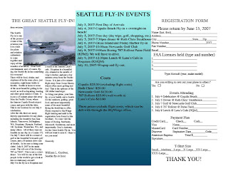
This page consisted of the "registration form" (a required element), a brief description of the event, and the "fly-in" events. This was done using Adobe InDesign, with features such as tab marking and text wrap around an image. It was quite helpful.
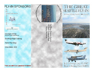
I created all three of these "pages" in Adobe Photoshop, and then brought them over to InDesign. Nothing too exotic here just some angular text, using the magic wand to isolate an airplane from a photograph, and using the Paint Bucket and "cloud" filter for the background effect.

This page consisted of the "registration form" (a required element), a brief description of the event, and the "fly-in" events. This was done using Adobe InDesign, with features such as tab marking and text wrap around an image. It was quite helpful.

I created all three of these "pages" in Adobe Photoshop, and then brought them over to InDesign. Nothing too exotic here just some angular text, using the magic wand to isolate an airplane from a photograph, and using the Paint Bucket and "cloud" filter for the background effect.
Photoshop Fun
Advertisements
These are two very different advertisements I created for Visual Technology. One is for the Japanese "human umbrella" (hito casa), and the other is for the versatile Cessna 208B Grand Caravan. We utilized various filters and effects, as well as text effects to best market our products. This was a very fun assignment.
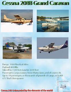
This is an advertisement for the Cessna 208B demonstrating all of its potential elements and configurations. The idea was to show how versatile this aircraft can be. Also, I added a perspective in text effect. This is essentially copying the layers a bunch of time and putting them all in order to create a depth effect. I like this.
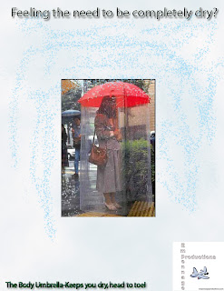
The Japanese umbrella picture was found on a website advertising other "unique" Japanese products. It is humerous, but it is also effective in keeping one dry. I used a rain effect with the paint brush, which scatters little paint drops which look like rain all over.

This is an advertisement for the Cessna 208B demonstrating all of its potential elements and configurations. The idea was to show how versatile this aircraft can be. Also, I added a perspective in text effect. This is essentially copying the layers a bunch of time and putting them all in order to create a depth effect. I like this.

The Japanese umbrella picture was found on a website advertising other "unique" Japanese products. It is humerous, but it is also effective in keeping one dry. I used a rain effect with the paint brush, which scatters little paint drops which look like rain all over.
Shorecrest competition posters
This year, shorecrest had three exciting competitions: The Battle of the Bands, the Film Festival, and the Art Expo. It was the visual tech class' job to design the posters to promote these events. Most of these utilize the "threshold" effect, turning the picture/design into a black and white shaded finish.
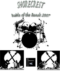
The Battle of the Bands poster is one of my best creations, in my humble opinion. It involves a complicated text effect, much use of the "Dodge and Burn" tools to facilitate use of the threshold filter, and free transform. This is where I utilized free transform best, with clashing guitars in front of a nuclear explosion. I am proud of this one.
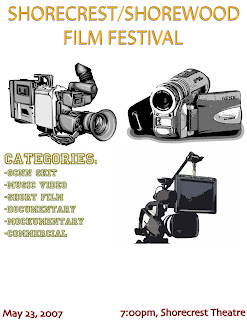
This is my only poster in this category not in threshold. However, I did apply multiple cartoon like filters to get the cameras the way they are. Also, used the "Princeton" font for parts of this. I don't believe I use this font in any other creation.
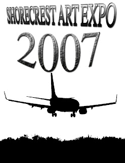
This poster is fun because it involves a picture of a Boeing 737-700. I always love airplane pictures, and learning to manipulate them this year had been quite fun. Also, used the brick texture effect in the "2007" part of the font. A nice addition I think.

The Battle of the Bands poster is one of my best creations, in my humble opinion. It involves a complicated text effect, much use of the "Dodge and Burn" tools to facilitate use of the threshold filter, and free transform. This is where I utilized free transform best, with clashing guitars in front of a nuclear explosion. I am proud of this one.

This is my only poster in this category not in threshold. However, I did apply multiple cartoon like filters to get the cameras the way they are. Also, used the "Princeton" font for parts of this. I don't believe I use this font in any other creation.

This poster is fun because it involves a picture of a Boeing 737-700. I always love airplane pictures, and learning to manipulate them this year had been quite fun. Also, used the brick texture effect in the "2007" part of the font. A nice addition I think.
Greeting Card
This is an aviation related greeting card with a punchline often used to describe the weather in the midwest. This was done using "Layer effects," various filters, and a few custom shape tools.
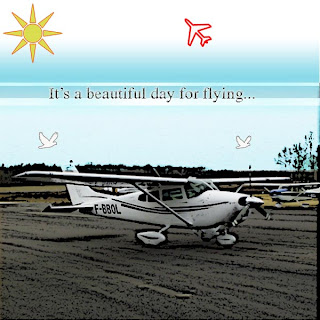
This front part of the card was a little difficult to make becuase I was trying to photoshop in a perfect sky into the rest of the picture. I also used the custom shape tools to create the sun and the airplane. That was very helpful. We used poster edges for the effect on the ground. The text is pretty straight forward, just with a drop shadow thrown in.
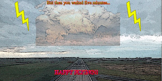
The inside made use of more custom shape tools with the lightning. Once again, we used poster edges for continuity's sake. This is a fun card for aviators, especially in the midwest.

This front part of the card was a little difficult to make becuase I was trying to photoshop in a perfect sky into the rest of the picture. I also used the custom shape tools to create the sun and the airplane. That was very helpful. We used poster edges for the effect on the ground. The text is pretty straight forward, just with a drop shadow thrown in.

The inside made use of more custom shape tools with the lightning. Once again, we used poster edges for continuity's sake. This is a fun card for aviators, especially in the midwest.
Subscribe to:
Comments (Atom)
